Team
UX Designer: Senada Krvavac
Product Manager: Greg Koss
Program Managers: Devin Olsen, Sam Wiltgen, Michelle Fraser, Doug Mandrell
Engineers: Global Health Technology Engineering Team
Overview
Amazon’s Return to Work Tool is currently being used to assign job accommodations to associates recovering from a work related injury, an illness, restrictions related to disabilities, non-work related medical conditions, or pregnancy. Joining halfway into the project, it was my job to help improve the tool’s user experience and hit key objectives and success criteria.
Problem
The current version of the tool lacks flexibility, automation, and does not connect any related features together. This leaves it unable to scale when the tool begins introducing more users, receiving more associates needing accommodation, and expanding to different countries. It also impacts the time it takes for users to let an associate know whether they have received an accommodation or not, resulting in lost wages for the associate.
Learning about the product and goals
I joined the project midway and found that I had a lot of catching up and learning to do. I was able to speak with our product manager and engineering lead to learn what the tool’s purpose was, its functions, and identify our product goals and success criteria. Key goals we aimed to hit by redesigning the tool’s experiences were:
Reduce turnaround time from receiving paperwork to the delivery of an accommodation offer letter. This currently takes 3-7 days. We aim to reduce it by 10%.
Reduce time users spend per associate. Currently they spend about 30 minutes per associate; the goal is to reduce it by 50% to about 15 minutes.
Increase our Net Promoter Score (NPS) from the current -15.
Improve the Recordable Injury (RI) to Lost Time Incident (LTI) conversion rate by 30%.
Original Job Match Report
Gauging user satisfaction and needs
Previous surveys that were sent to users showed that a majority of their frustrations centered around process issues, difficulty of use, technical glitches, and the need for more features like automation. These gave me great perspective into our user’s mental models. However, I wanted to try a more personal approach to draw out more information that perhaps couldn’t be captured in an online survey.
I organized interviews with 5 people in each user group: Onsite Medical Representatives (work related accommodations) and Accommodations Consultants (non-work related and work related accommodations).
The following are interview questions I prepared and the goal I set to achieve.
Each user had unique experiences, so I would adjust certain questions or improvise with new ones to dig deeper into something they were sharing. Speaking with all of the users gave me valuable new information to share that wasn’t captured in previous surveys.
Pain Points
The Job Match Report process should auto-fill fields and dropdowns; filling these takes up a lot of their time.
Information should automatically update so they can avoid having outdated or incorrect information.
The tool was not intuitive. Users believed there should be some sort of tutorial for new users.
Have a clear and easy way to find either work related or non-work related cases. Users find it difficult to find cases that pertain specifically to their responsibilities.
Have the tool provide ways to gain more visibility. Users are constantly reaching out to coworkers to understand why something was done or to see why certain accommodations weren’t granted.
These responses followed a similar pattern – the tool was creating too much extra work for users rather than lessening their burden.
Where I shared with my team user interview questions, responses, user personas, and user stories.
Simplifying the user’s processes
Feedback and insight from users helped to narrow down what was a must-have for our initial release and what our nice-to-haves were that we could include in a future iteration. Because of our hard release date being set to August 30th, 2022, I knew I had to keep to a tight schedule and not interrupt the current flow.
I followed the current engineering sprint schedule and worked closely with our product manager, engineer lead, and program managers to ideate new process flows and designs based on user interview responses. By offering new ways to approach old processes, I was able to:
Cut down the list of site pages,
Simplify actions, and
Optimize designs to leave less guesswork for users.
Once new processes were brainstormed and approved, I moved on to designing mockups.
Example process flow depicting an automated version of the Job Match Report process.
Archived ideas and final mockups
Our product manager had previously created wireframes to help the engineering team understand concepts and how the interface should approximately look. Working with him and our engineering team, we found what worked, didn’t work, and what would be included in future iterations instead. A few concepts we’ll be adopting later are an onboarding process for new users, different dashboard views for specific users, and bulk actions.
Archived ideas ready to be used in next releases
I worked on creating high-fidelity mockups each sprint, gathered feedback, updated designs, and passed it on to engineers assigned to specific pages. By being open to different opinions and learning why certain design choices I made weren’t technically logically feasible, I was able to pass along designs aimed to solve user needs and be ready to scale.
Job Configuration
The previous New Job Configuration process required a long search through a database to find which tasks to add and which sites the job is applicable to. Now, the form is easier to scan and tasks and sites have a simpler select and type dropdown.
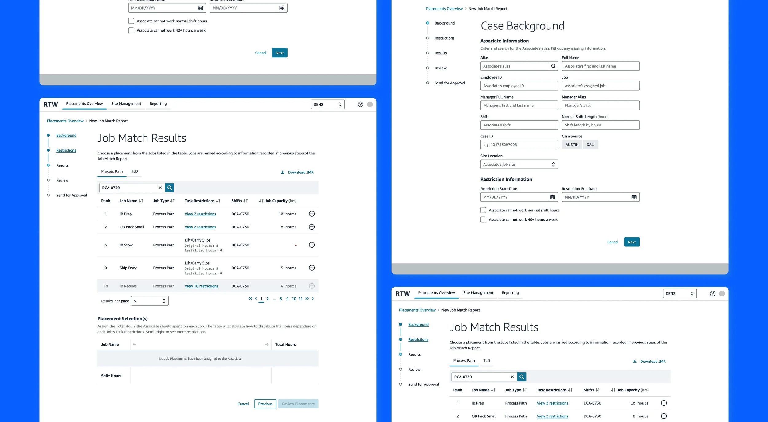
Job Match Report
The Job Match Report was the most important feature being redesigned. The previous process included far too many steps, constant back and forth between different software like AUSTIN and DALI, and it didn’t take into account several concepts that users shouldn’t be expected to memorize (ex. the hundreds and thousands of potential job accommodations associates can be granted). By simplifying and automating the process, users are able to take a doctor’s restriction form, input the information into the report, and have the best job matches displayed first.
Previously, users would send reports to senior leaders and have them denied because the tool would provide any job without considering how they can be scheduled into the associate’s shift. The redesign now allows for an experience similar to a shopping cart. The user selects a job that has been automatically ranked in the back-end and the system will automate how hours will be dispersed based on a formula. This helps improve the Recordable Injury to Lost Time Incidence conversion rate by decreasing the chance of an accommodation being denied.
Placement Management
The current tool does not have any home page that provides immediate and pertinent information to the user. They need to keep track of their cases to make sure that none of them are pending for longer than they should. By adding a dashboard view such as this with the most important information immediately on display, users can make accurate judgements on actions they need to take in their day-to-day.
A new feature we provided them as well is the ability to view each associate’s case. In this page, users can take actions such as deleting the placement, updating their status, sending status emails to leaders, and exporting the associate’s Job Match Report or Temporary Work Placement Accommodation form.
Update Site Capacity and Shift Details
The site and shift capacity pages are now redesigned in a way that allows both functions to be connected. Previously, there was no way to know what shifts were attached to certain jobs and how many available accommodations they had left grant to associates. Now, shifts can be created and then added to jobs they fall under. This gives users more visibility to everything that can impact associates and their ability to get an accommodation right for them.
Post-release results
The project turned out to be a success!🥳 The metrics we used to track this were:
After the experience redesign was released, the tool drove $43.3M in lost wage avoidance.
The new job-matching experience helped avoid 1560 lost time incidents by allowing users to find more accurate accommodated work for associates who were injured.
Net Promoter Score increased by 10 points, the previous score being -15.
Streamlined manual entry of employee information resulted in a decrease in associates' average Days Away from Work from 42 days to 28 days. The user’s ability to now quickly enter and assign accommodated work left associates waiting less days to hear back.
Despite some users’ frustration over having to now follow the process more strictly, there has been overwhelming relief. With the previous design, users were confused about how to use the tool, training provided no relief, and the experience was so drawn out that completing a single accommodation took up large chunks of time. Now with the new 2.0 version, users find the tool more intuitive, easier and more efficient, and much more streamlined. AND, the best improvement of all, our associates can now be accommodated even faster and not lose money that they deserve.
If you would like to connect to learn more about the project that I haven’t included here, feel free to contact me 😊