Team
UX Designer: Senada Krvavac
Product Manager: Beth Styles
Front-End Engineer: Teresa Liu
Back-End Engineer: Amulya Yeduguri
Mobile Engineers: Anthony Chan, Ryan Newhouse
Overview
Amazon Chime is a communications service that allows customers to meet through virtual calls, chat, and place business calls inside and outside your organization. I led the redesign of Chime’s current meeting scheduling process and a new waiting room feature that:
Gives users more control over who they allow into their meetings,
Helps hosts understand the permissions they are setting, and
Provides a frictionless experience that improves meeting security and visibility over who is not directly invited by the host.
Problem
10.4% of weekly Chime meeting attendees are anonymous. This increasing number of anonymous attendees coincided with increasing episodes of ‘Zoom-bombing’, where seemingly private meetings were being intruded on by individuals who were not invited. Our customers had no way of being alerted when anonymous users joined, did not have ways to easily identify them, and had no control over who has access to a meeting and who does not.
Understanding our users and goals
I wanted to get a grasp on the motivations behind the request for a new feature and understand what users are specifically pained by, what the product and business needs are, and how we will be measuring whether this project was a success or not. Were there any previous metrics we are hoping to improve?
I parsed through feedback from users that were collected in routine surveys sent out, speaking with meeting moderators, and finding relevant ticket submissions that our team regularly tracks. I was able to learn the following:
Pain points
Meeting creators reused meeting pins when creating new meetings. This led to others attempting to join meetings early but finding themselves intruding an ongoing meeting.
Moderators of large meetings were struggling to keep track ofand vet all anonymous attendees present in their meeting.
Business needs
A low-cost and easy way to monitor anonymous users.
A mechanism that blocks individuals from classified meetings.
Tracked metrics
The only metrics being tracked at the time were how many meetings each week contained anonymous users and how many tickets are submitted by users that detail complaints about meeting privacy and security.
A decrease in anonymous user traffic and a decrease in meeting security breach ticket submissions would determine success.
Diving deeper into the space
To be able to design an experience that can successfully mitigate any security risks and provide visibility of anonymous guests to users, I started by first taking the time to understand the foundations more. Those foundations include diving deeper into the meeting creation and join process, what different permissions are given to specific users, and how different permissions affect how these users can join or create meetings.
After having a solid understanding of all this information, I translated it into clear documentation and visuals. Doing this allowed me to provide clarity to my teammates and more clearly communicate proposed changes I wanted to make.
Competitive analysis
To avoid reinventing the wheel, I looked out towards our direct competitors to see who has already created successful security measures for their meetings. I found that our competitors all had clear settings in their meeting creations around security, as well as their own versions of a Waiting Room. I then analyzed what their differentiators were, what worked and didn’t work, and opportunities where we could provide a better experience.
Determining the project timeline
A concern I had at the beginning of drafting our schedule was not including a redesign of the Meeting Scheduler. The original project timeline (broken into two phases) didn’t include this redesign until months after Phase 2 was released. Feedback from users, however, told me that not including this at the very beginning was out of the question. They found the language in the scheduler to be extremely confusing and did not understand what permissions they were setting for meetings and what certain terminology meant. I advocated how crucial it was to rebuild this early in Phase 2 and was successful.
Our finalized project roadmap specified releasing this project in two phases; Phase 1 would only bring attention to anonymous guests and not have a Waiting Room, and Phase 2 would be the final and complete Waiting Room feature. Our roadmap was split in two main phases in order to more quickly address certain security concerns as early as possible. The Waiting Room itself would take longer to complete, so an earlier solution was needed.
To ensure that each phase release was scalable, I worked with the engineers and the product manager to identify potential constraints or concerns and develop solutions.
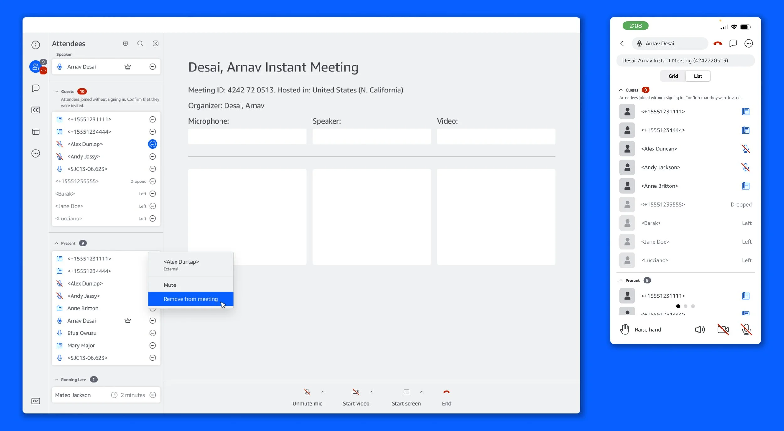
Design Phase 1: Guest section
Balancing urgency with distraction
Beginning the project, I went through several different ideations for ways we could bring attention to anonymous users. My focus was to make sure we were not distracting authenticated people in meetings but also to make sure that the right level of urgency was being placed. I also wanted this feature to be able to smoothly transition into a Waiting Room with low development cost and no need to build this from the ground up after investing so much time in the first phase.
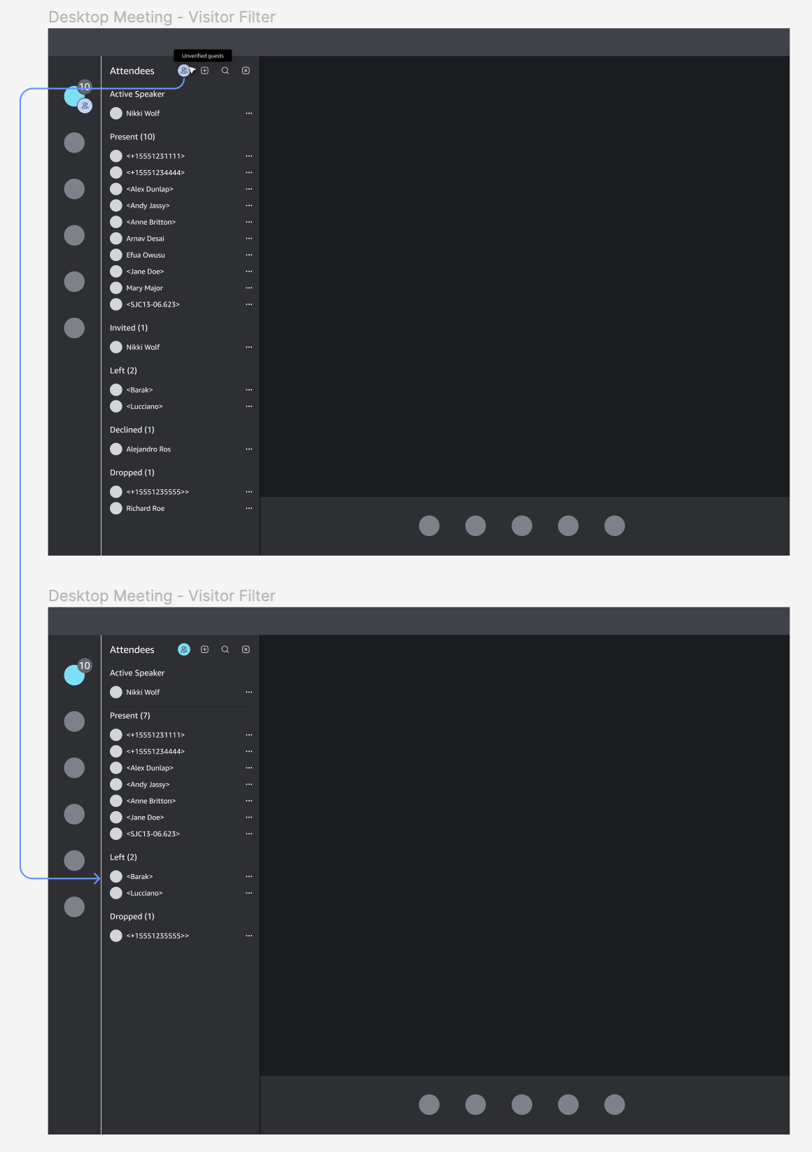
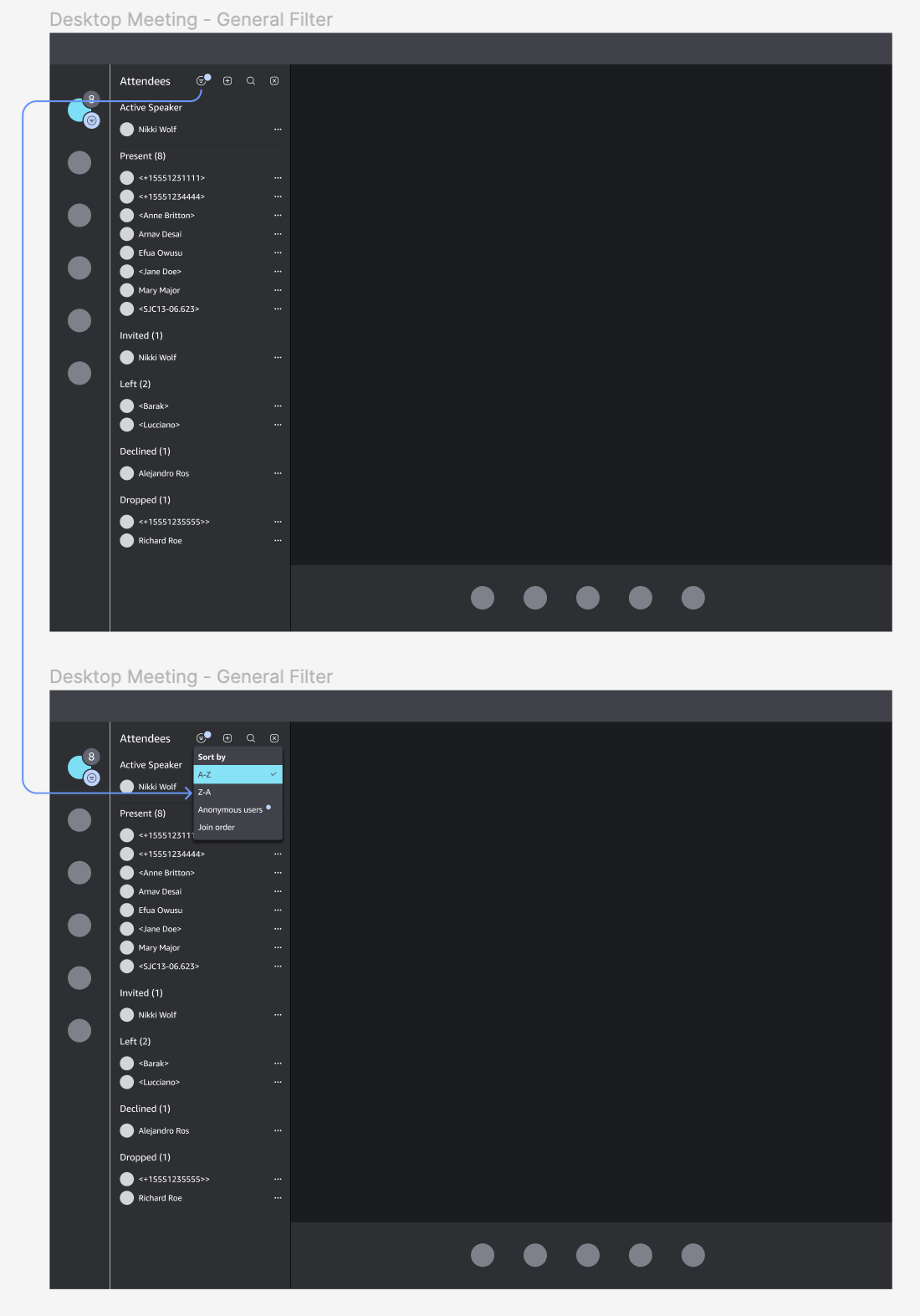
1. The first idea was a new separate panel that shows an isolated list of all anonymous users. The purpose was to try and create fewer distractions, but when I designed a hypothetical instance of having all panels open at the same time, it ended up defeating the purpose.
2. These next two are playing with the concept of perhaps adding a filter to the main attendees panel. The focus of this was to minimize the space it would take on the screen to show attendees, but it ultimately didn’t draw enough attention when an anonymous user joined the meeting. The first reason for this was that the highlight over the filter icon was not an obvious indicator of anonymous attendees being present. The second reason was that previous user interviews and surveys found that, in meetings, users put a majority of focus on the attendee list and screenshare/video tiles. The filter would be easily lost in the sea of other visuals competing for attention.
Final Mockups
In the end, taking inspiration from these ideations and waiting rooms from competitors, the final concept became the Guest Section. The drivers leading me in this direction were visibility (it would provide users as to who in the meeting was an anonymous guest), the addition of a new accordion component (a large influx of guests would not be intrusive to verified users), and long-term scale (would require minimal work and cost to build a Waiting Room from this design).
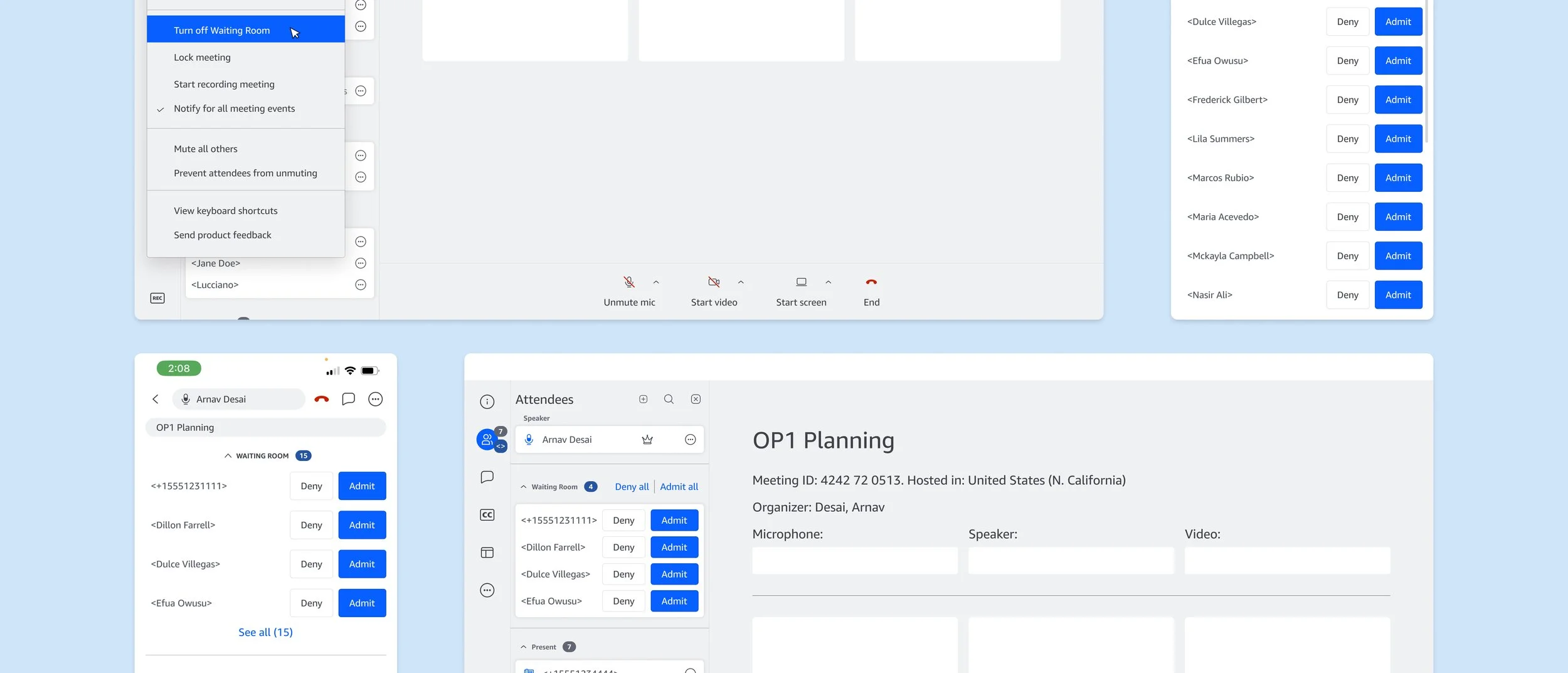
Design Phase 2: Waiting Room
Ideation
When creating the Waiting Room, we now had to also consider new flows around the ‘wait to join’ experience, the meeting scheduler, and dial-in. Special consideration to language choice was incredibly important at this phase. A large bulk of user pain points + needs centered around confusion with the meaning of written content (what is the product asking of them or instructing them to do?). With the introduction of more nuanced user group permissions came the challenge of writing security settings in a way that could be easily comprehended. If not done correctly, we would not have solved for our users’ pain points.
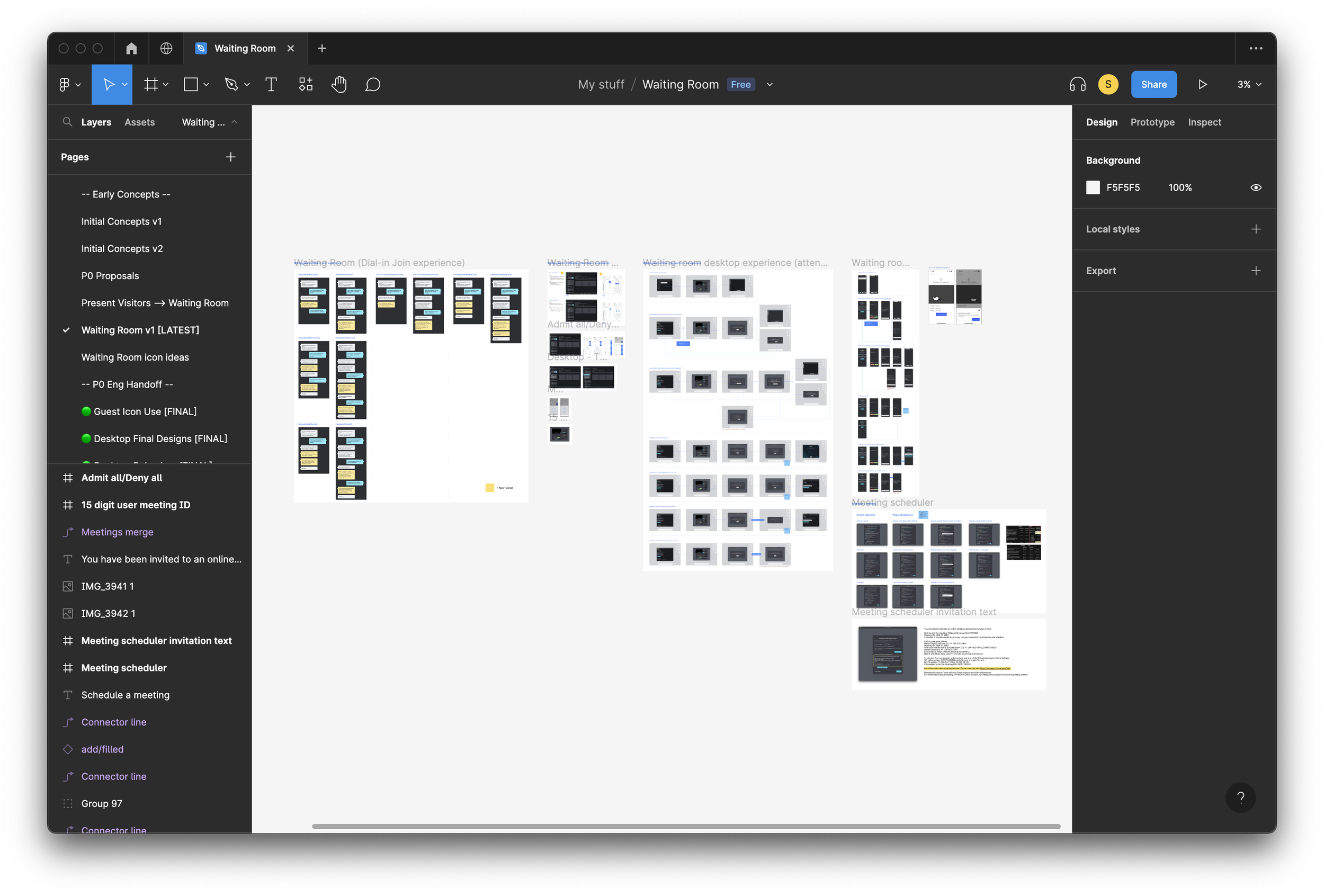
Final Mockups and Flows
The final Waiting Room experience was designed to allow hosts to easily identify and manage attendees before admitting them to the meeting. A list of all attendees waiting to join are displayed along with their names and any relevant information (such as their email address). Hosts can then review this information and either admit the attendee to the meeting or deny them access. Additional security features were also added, such as the ability for hosts to lock the meeting once all attendees have joined and to remove attendees from the meeting if necessary.
All of these features helped to ensure that only authorized users were able to access the meeting, potential security threats could be quickly addressed, and folks trying to join meetings early would avoid overhearing confidential information.
Remaining work and post-release plan
Final design mockups, prototypes, and documentation are in the hands of engineers, and dial-in strings are recorded and ready to be implemented. We’ll be initially releasing this to our Bravehearts, a group of thousands of internal Amazonians that have volunteered to be the first to test new feature releases or redesigns. Here, we will be testing, gathering feedback, and iterating on the feature before we release it to the general audience.
Working on this feature gave me an opportunity to go even deeper into our product and learn all of Chime’s back-end and security intricacies. Keeping our users and accessibility at the forefront of conversations, I’m proud of the work done here and look forward to continuously improving and building on this!
If you would like to connect to learn more about the project that I haven’t included here, feel free to contact me 😊